
My new site…
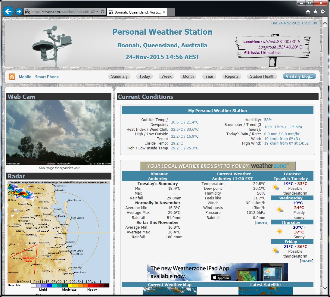
My weather site had been feeling a bit tired. It was based on the templates that came with WeeWX which were written using earlier versions of HTML. I have added bits and pieces to the site over time just by tacking them on so my code was a bit of a mishmash. There was duplicated code everywhere, IDs used when they should have been classes, redundant IDs and classes and not the best layout. I had too many colours in use in the pages. I’d used three separate CSS files to style the weather pages with common code occupying the majority of these files. These old templates didn’t incorporate any of the more modern HTML5 or CSS3 code that is available.
HTML5
The first thing I did was convert my templates to HTML5. This was simple, I just changed the declaration from
<!DOCTYPE HTML PUBLIC "-//W3C//DTD XHTML 1.0 Strict//EN" "http://www.w3.org/TR/xhtml1/DTD/xhtml1-strict.dtd">
<html xmlns="http://www.w3.org/1999/xhtml">
  <head profile="http://www.w3.org/2005/10/profile">
    ...
  </head>
  <body>
    ...
  </body>
</html>
to
<!DOCTYPE html>
<html lang="en-AU">
  <head>
    <meta charset="utf-8">
    ...
    <link rel="stylesheet" href="css/normalize.css">
    ...
    <!--[if lt IE 9]>
    <script src="http://html5shim.googlecode.com/svn/trunk/html5.js"></script>
    <![endif]-->
    ...
  </head>
  <body>
    ...
  </body>
</html>
So much simpler. Now I can use elements like <nav>, <header> and <footer>.
In the code above, you can see where I link to normalize.css. Normalize.css is a customisable CSS file that provides better cross-browser consistency as it renders HTML elements in a default style and in line with modern standards. This sets all styles to a common starting point in most browsers. You can find more information and download normalize.css over on Github.
The next few lines refer to http://html5shim.googlecode.com/svn/trunk/html5. These are there to enable HTML5 for people using Internet Explorer 9 or earlier. Hopefully there aren’t too many out there using this old browser but the link is put there for backward compatibility. It is ignored in more modern browsers. There is more information on this here.
CSS
As I had three separate CSS files for the various pages, I combined them all into one. Part of this included going through the ID and class references in my HTML code and rationalising them. I realised I had several references to the same ID (IDs should be unique) and I’d used several class references when a single one would suffice. I was able to simplify my code considerably and from there was able to make some cosmetic changes to the pages. CSS3 allows much more styling, for example the border-radius used on the various boxes.
Colours
The next thing I looked at was the colour palette for the site. I have linked to a couple of external tools (Weatherzone, Flag Counter, BOM) on the home page which have fixed colours so I utilised these as the basis for the palette.
I ended up with this range of colours in my palette:
Once I had the palette, I went through my CSS and changed most of the colour references to these.
Layout
The layout of the pages wasn’t the best with the column lengths varying greatly especially when viewed on different devices. I moved some sections around and styled others slightly differently. I think this will be a constant work in progress as I will be always be tweaking it here and there.
Next Steps
I want to make the pages fully responsive between devices. It is okay viewed on a desktop computer, a laptop and even a tablet, but viewing the pages on a mobile phone is not the best.
I have been looking at Bootstrap as a way of achieving this but I fear this will lead to another total revamp of the site. This should be fun but maybe a small break first!